02 · Materials
Toned Paper
Start on grey and you already have the middle tone; from there you can go dark or light, which is exactly why Turner never put it down.
 02.3
02.3The Middle Tone That Does the Work
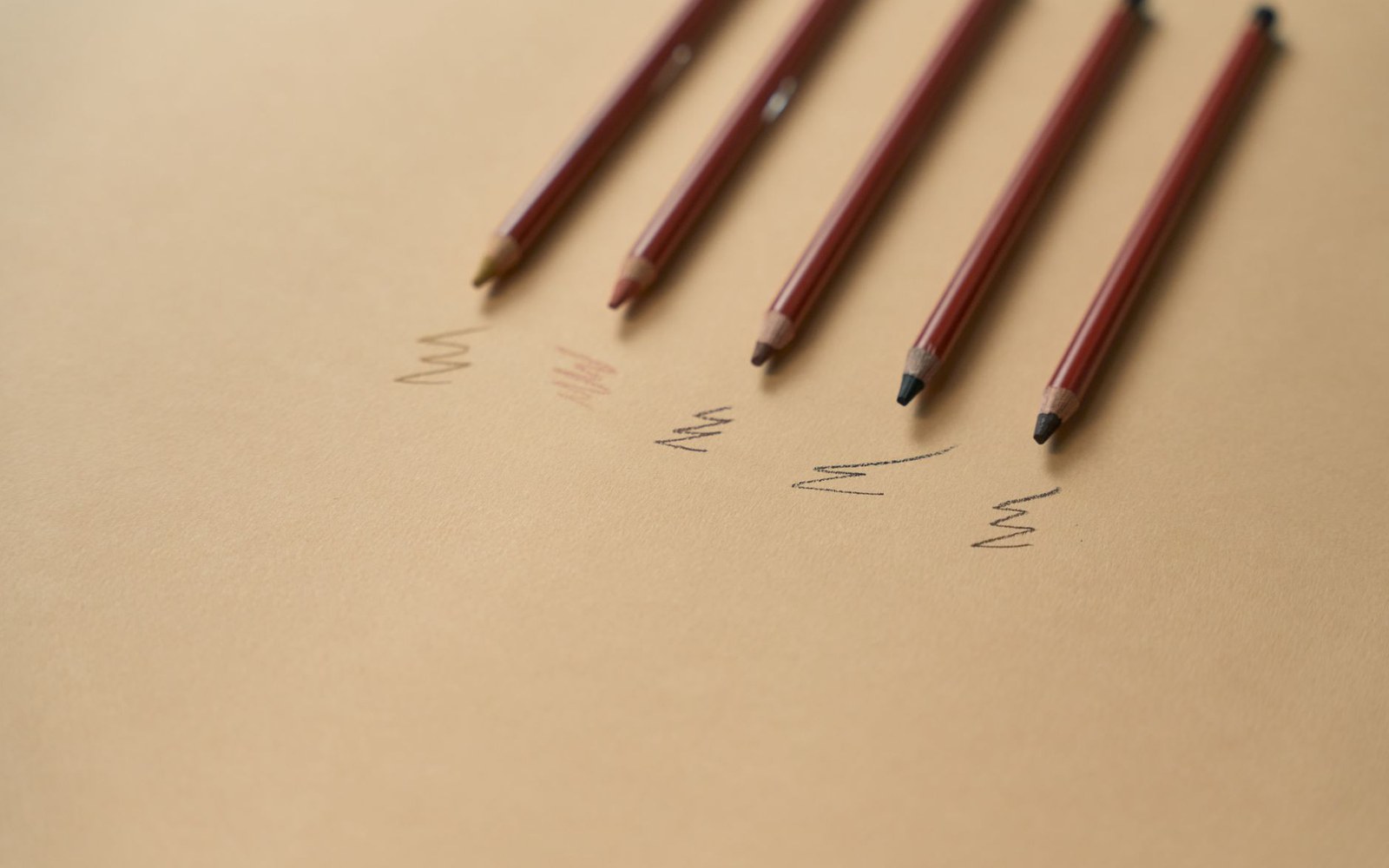
A white page puts you at the bottom of the tonal scale. Every mark you make is darker than the ground, which means highlights — the bright edge of a wave, the lit face in a crowd, the pale sky above a roofline — have to be left as absence. That is a skill, and a laborious one. Toned paper removes the problem by beginning in the middle. Grey, ochre or buff paper gives you a ground that reads as ambient light, and from there the drawing can move in either direction: dark line or wash downward into shadow, white gouache upward into brightness.
J. M. W. Turner worked this way systematically. His roughly three hundred surviving sketchbooks, held at the Tate, include many sequences on grey and blue-grey paper where the pencil builds the structure of a scene and bodycolour — white or near-white gouache — pulls the sky or water forward into light. The paper itself carries the scene's midrange without a single mark, which is why a Turner notebook page can read as atmospherically complete even where the drawing is sparse.
How the tonal logic works
- 01white page — every mark is darker than the ground; highlights must be left as unpainted absence
- 02toned paper — the ground reads as mid-tone; drawing moves both darker (line/wash) and lighter (gouache)
- 03bodycolour — opaque white or near-white gouache used to add light rather than reserve it
The practical reason location drawers reach for toned paper is speed. When the twenty-minute limit is real — light shifting, subjects moving — you cannot afford to construct the whole tonal range from scratch. A grey ground does roughly half that work before the pen is uncapped. White gouache, applied with a waterbrush or a small soft brush, then operates as a drawing tool rather than just a correction fluid: you are adding light, not subtracting dark.
Annotation matters here too. On toned paper, handwritten colour notes in pencil read clearly without competing with the drawing's marks — the page has already separated itself from the white of ordinary writing paper, so words and image coexist without the visual confusion that a busy white sheet can produce.
The drawbacks are real. Coloured paper is harder to scan accurately, and the reproduction of notebooks on toned grounds has historically distorted the tonal relationships that make the originals legible. More critically, the pigments in toned papers vary in their lightfastness: some ochre and buff papers have yellowed or shifted significantly over decades, altering the relationship between the ground and any marks made on it. This is a documented conservation problem across many nineteenth-century working sketchbooks.
None of which makes the method wrong. It makes it a choice with consequences — which is what every material decision in location drawing actually is.